
Specialty finishes like spot UV and foil are what make a printed piece look expensive. They are also the most likely to go sideways when the file isn’t set up correctly. The good news: they all work the same way, and the setup is simple once you understand one idea.
The One Idea to Remember
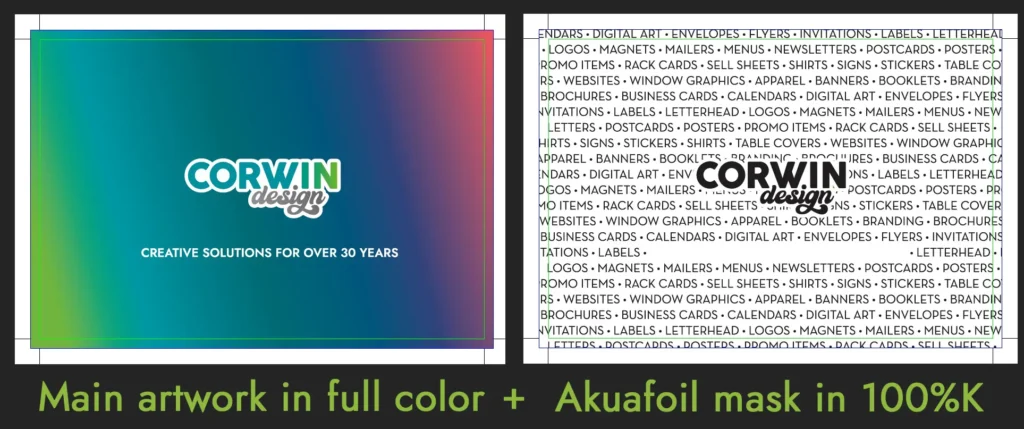
Specialty finishes only go where you tell us to put them. Your file has to show us exactly where. We do that with a mask: a second, black-and-white version of your design that marks the areas to be treated.
Think of it as a stencil. Black means “put the effect here.” White means “leave it alone.”
Check out our file below that shows how we created the card in the featured image of this blog:

The Finishes That Need a Mask
Foil Stamp is a thin metallic layer pressed onto the paper. Gold, silver, and rose gold are available. It’s shiny, reflective, and impossible to create with ink.
Raised Foil is a thick metallic coating applied to specific areas, like a logo or a headline, usually on top of a matte or soft-touch surface. It’s available in gold, silver, and holographic foil
Akuafoil is an inline foil printing process that applies a silver metallic foil base underneath standard 4-color (CMYK) printing. This allows almost any CMYK color or gradient to take on a sparkling, metallic finish.
Spot UV is a clear, glossy coating applied to specific areas, like a logo or a headline, usually on top of a matte or soft-touch surface. It catches the light without changing the color underneath.
Raised spot UV is a thicker version of spot UV, built up so you can actually feel it. Think of a clear bump on the page.
None of these are printed with regular ink. Each is applied or formed in a separate step, which is why each one needs its own instructions.
Other finishes, like die cuts (custom-shaped cutouts) or white ink, follow the same approach but can have their own setup rules. If your design includes one, ask us first.
How the Files Work
You’ll send us two files for each finish:
- The main artwork. Your full-color design, exactly as you want it to look, with everything in it. If you want a foil logo, the logo may not appear in this file at all.
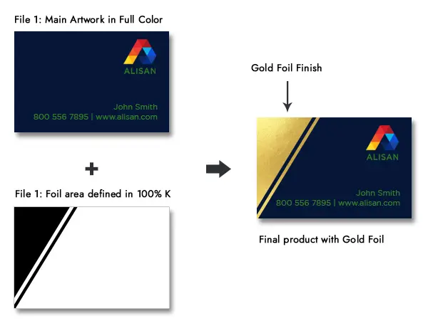
- The mask file. The same page, same size, with only the treated areas filled in solid black (100% K). Everything else is white or empty.
The example below shows the idea: the navy card is the full-color artwork, and the black shape in the second file tells us where the gold foil goes. The finished card has foil exactly where the black was.
If you’re doing more than one finish, each finish gets its own mask file. Don’t combine them. A job with two finishes means three files in total.
Why We Ask You to Skip Canva
We like Canva for social posts and flyers you’ll only ever view on a screen. For print finishes, it’s the wrong tool, for a few practical reasons:
- It’s built for screens, not presses, so color and file settings aren’t designed for print.
- It doesn’t give you the precise control needed to build a clean mask that lines up perfectly with your artwork.
- Exported files are often flattened or converted in ways that make fine details harder to separate.
We recommend Adobe InDesign or Adobe Illustrator. Both let you work with exact sizes, bleed, and layers, and both export clean PDFs. If you don’t have either one, or you’ve never used them, send us your project early and we’ll help you figure out the best way forward. That’s a much better conversation to have before the deadline than after.
Setting Up Your Files, Step by Step
- Build the artwork at the final size. Include bleed (the extra artwork that extends past the edge so nothing white shows after trimming). We’ll send you a template if you need one.
- Duplicate the file or page. Same size, same bleed, same everything. This becomes your mask.
- In the duplicate, delete everything you don’t want treated. Photos, background colors, body text, all of it.
- Fill the areas you do want treated with 100% black (K). Basic 100% K, with no gradients or transparency. Make sure the background is white or empty.
- Export both as PDFs and label them clearly, for example, BusinessCard_Artwork.pdf and BusinessCard_Foil.pdf.
Keep your mask as vector artwork (shapes and text) wherever you can, not a picture of shapes. Vector stays sharp at any size. Pictures can get fuzzy edges, and fuzzy edges become fuzzy foil.
Mask Design Rules
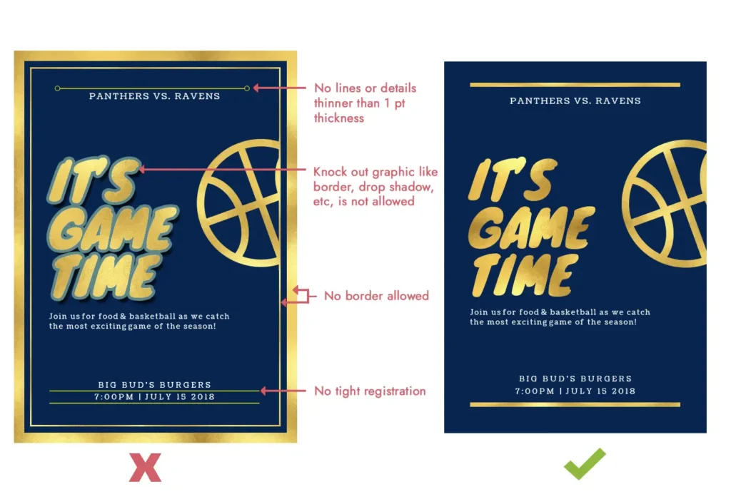
These special effects are physical, so they have limits that screen design doesn’t. These are the ones that trip people up most often (see the example comparing a file that won’t work with one that will):
- No lines or details thinner than 1 pt. Hairlines don’t hold up. They break up or disappear.
- No knockout effects. Outlines, borders and drop shadows around elements can’t be reproduced. Keep the shapes clean and solid.
- No borders along the edge of the page.
- No tight registration. Effects can land a tiny bit off from the printed ink beneath it. Don’t design foil to line up exactly with a printed line or edge. Leave breathing room, or let it sit on its own area.
Short version: bold, simple shapes look great. Delicate, fussy details do not.
Keep shapes bold, avoid hairline details, and don’t rely on perfect alignment with printed elements. It looks best on large type, logos and patterns, and over darker or matte backgrounds where the gloss stands out.
If you’re unsure about a particular design, ask us before you build it.
Quick Checklist
Before you send your files, make sure that:
- You made the file in InDesign or Illustrator (not Canva).
- The artwork has bleed and is at final size.
- Each finish has its own mask file, same size as the artwork.
- Treated areas are 100% black, everything else is white or empty.
- Nothing in the mask is thinner than 1 pt.
- There are no mask borders at the edge, and no shadows or outlines on shapes.
- Files are exported as PDFs and clearly named.
Not Sure? We can help!
If you’re unsure about any of this, send us what you have. We offer full design services that include complex file setup!