
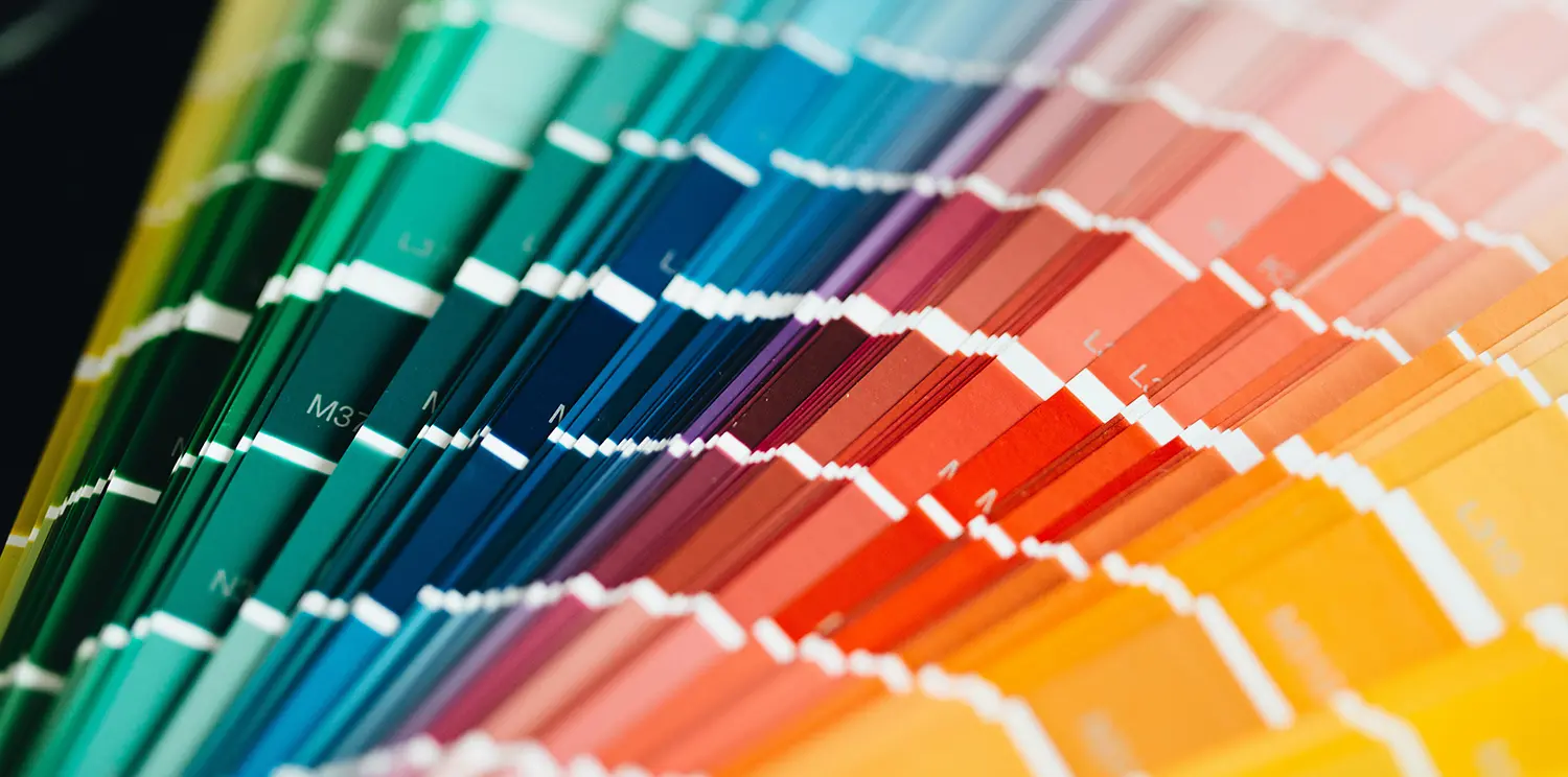
If you’ve ever ordered two different-sized print jobs from us – say, a postcard and a poster – and held them side by side under the office lights, you may have noticed something: the colors don’t match exactly.
Small color variation between print technologies isn’t a quality problem; it’s an industry-wide reality every print shop deals with, whether they explain it or not. We know that’s a frustrating thing to hear when you’re paying a professional print shop to get your brand right. So let’s actually explain what’s going on, because once you understand it, “close” starts to look a lot more like “exactly as expected.”
Ink and Toner Are Not the Same Material
Not all printers put color on paper the same way. Some spray microscopic droplets of liquid ink that soak into the paper fibers. Others use a dry, powdered toner that’s electrostatically charged onto the page and then fused with heat, so it sits more on top of the surface than inside it.
That difference matters more than you’d think. Ink that soaks into paper reflects light differently than toner that’s been melted onto the top of it. Orange, blue, and purple are all colors built by layering two other colors on top of each other, and how evenly those layers sit – inside the paper versus on top of it – changes how your eye reads the final hue. Two machines using two different technologies are, quite literally, building those colors two different ways.
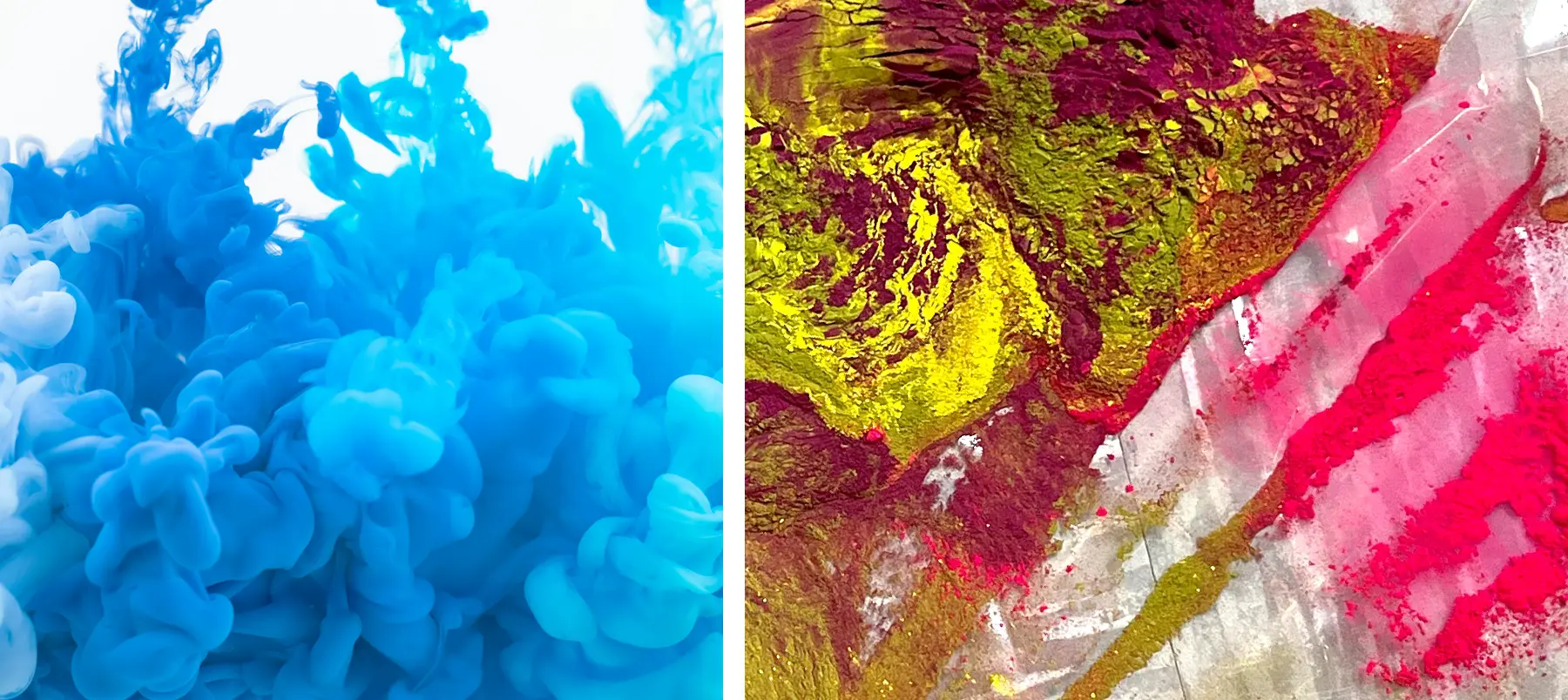
Ink (left) is liquid. Toner (right) is a dry powder.
Every Printer Speaks a Slightly Different Color Language
Every printing process – inkjet, toner-based digital press, offset – has a “gamut,” which is just a fancy word for the total range of colors it’s physically capable of producing. No two gamuts are identical, even between machines sitting ten feet apart in the same shop.
Think of it like translating a sentence between two languages that don’t have a word for the exact same concept. You get the closest available match, not an identical copy. Red, orange, rich blue, and deep purple all happen to sit right at the edge of what most print gamuts can reach, which is exactly why they’re usually the first colors to visibly shift when you switch machines. It’s not that one printer is “wrong” – both are doing their best within their own vocabulary.
Your Screen is in Another Color Space
This is the part that really matters for our MyCorwin clients: the calendars you’re designing and previewing in the app are built in RGB – the same color system your phone and monitor use, where color is made of glowing light. Print is the opposite. It’s pigment, reflecting light instead of emitting it, and that gives it a smaller, different range of achievable color than any screen.
So even before a job hits a specific printer, there’s already a translation happening – from the glowing red, blue, or green on your screen to the closest reflective version of that color any print process can physically produce. Screens are especially good at blue since it’s one of the primary colors of light, which is exactly why a rich blue or purple often looks a little more muted or shifted once it’s translated into pigment. That gap exists no matter which of our machines runs the job. It’s simply the difference between light and pigment.

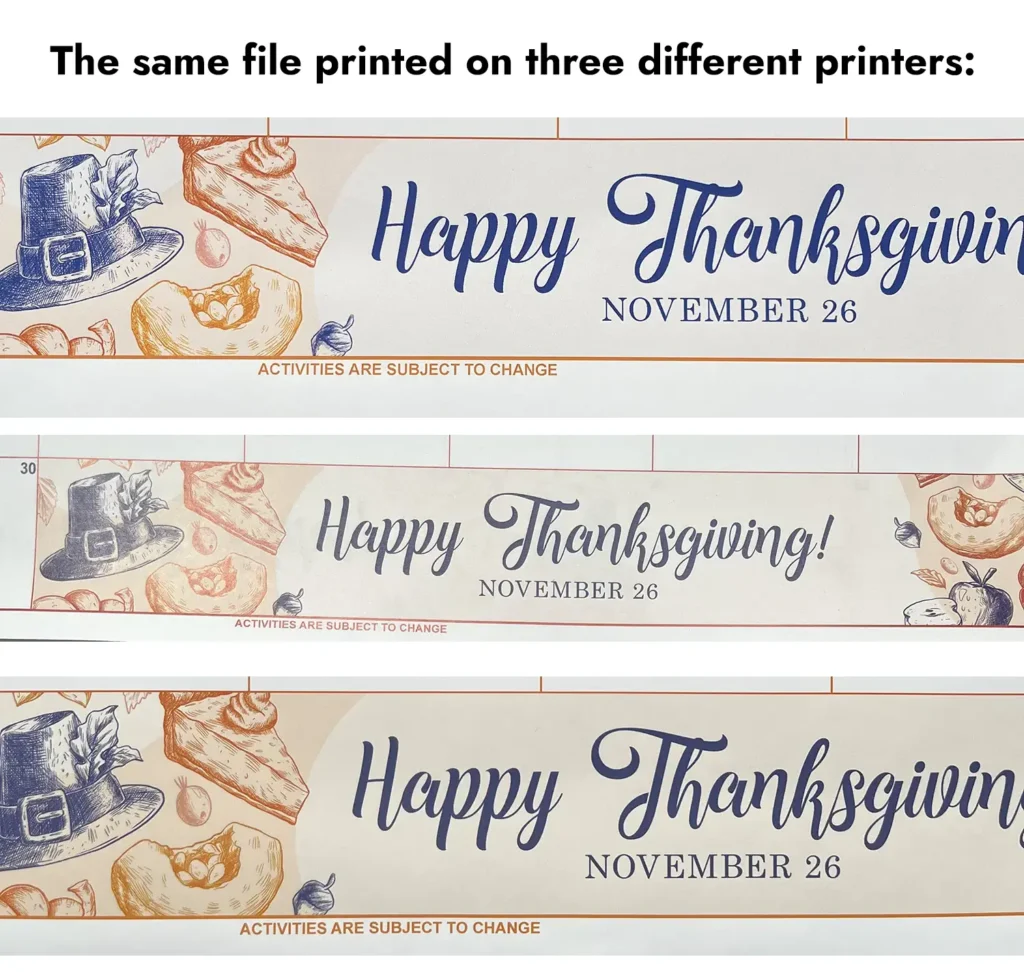
See how our different event colors look on 4 different printers in our office. Our large-format inkjet printer (far left) has the brightest, while our toner-based digital press (second from left) has the most subdued. Click the image to enlarge.
The Pantone Matching System
The Pantone Matching System is the print industry’s most precise tool. But it’s also the most expensive option.
A true Pantone match uses a premixed spot ink formulated to hit a specific, named color – that’s as close to “guaranteed identical” as print gets. But most jobs aren’t printed with a dedicated spot ink; they’re built out of process colors that simulate the Pantone target as closely as that machine’s gamut allows. Since every machine’s gamut is a little different, that simulated match will vary slightly from press to press too – even when everyone involved is doing everything correctly. Matching color is our job, and we take it seriously, but no print shop, including us, can force two fundamentally different technologies to produce an identical result.
There’s also a practical reason we don’t push every job toward a true spot match by default. A guaranteed Pantone color requires offset printing, where each spot color runs on its own dedicated metal plate – extra plates, extra setup, extra cost, and offset only pays for itself at higher quantities. Most of our clients order small runs of less than 1,000 copies, and that’s digital press territory: no plates, fast turnaround, and pricing that makes sense at low volume. The tradeoff is that a digital press can only simulate a Pantone color using its own process inks, not reproduce it exactly the way a dedicated plate can.
Coatings and Finishes Change the Color
Here’s a layer of the puzzle that has nothing to do with which machine printed the job: what goes on top of the ink or toner afterward.
A gloss laminate or gloss coating adds a smooth, reflective layer that bounces light straight back at your eye, which makes colors look deeper, richer, and more saturated. A matte laminate or matte coating does the opposite – it scatters that light in different directions, which softens colors and can make the exact same file look noticeably lighter or duller. Spot UV, where a glossy varnish is applied to just part of the page, creates contrast between the coated and uncoated areas, so the same color can look more vivid in the spot-UV area than it does two inches away on uncoated stock.
None of that is the ink or toner changing – it’s light behaving differently once it hits a different surface. Which means the finish you choose is its own variable, separate from which press ran the job, and it’s worth keeping in mind any time you’re comparing two pieces that used different coatings.
What We Do About It
We calibrate and profile our equipment on an ongoing basis, and our production press uses an inline color sensor that measures and adjusts output automatically as it prints, keeping color consistent within that machine’s own capabilities, run after run. That’s the level of control we can offer: tight, repeatable accuracy on a single device, and the closest reasonable match we can get across our different equipment.
What This Means for You
Holding tight color consistency across every job and every piece of equipment takes ongoing measurement and calibration, and often the plates or spot inks we mentioned above – all of which adds real cost, and for most short-run projects, that cost isn’t worth it. That’s why we don’t apply it by default. If brand color consistency across a large, multi-piece project matters enough to be worth that investment, tell us up front. We can plan the job to run on a single press, or set up a true Pantone spot match, to get you as close to identical as physics allows.
We’d rather set that expectation now than have you notice it later and wonder what went wrong. Nothing did – you just have a very sharp eye for color, and you’re noticing what we’ve been noticing for decades in the industry. 😉