Before & After
Glow-ups aren’t just for skincare routines and reality TV. Sometimes a brand needs one too: a font that isn’t fighting itself, a logo that doesn’t look like it’s from 2009, a layout that finally makes sense.
Here’s proof it works. Real client designs, before we got our hands on them, and after. Cue the dramatic reveal music – ok, don’t do that. Just enjoy!
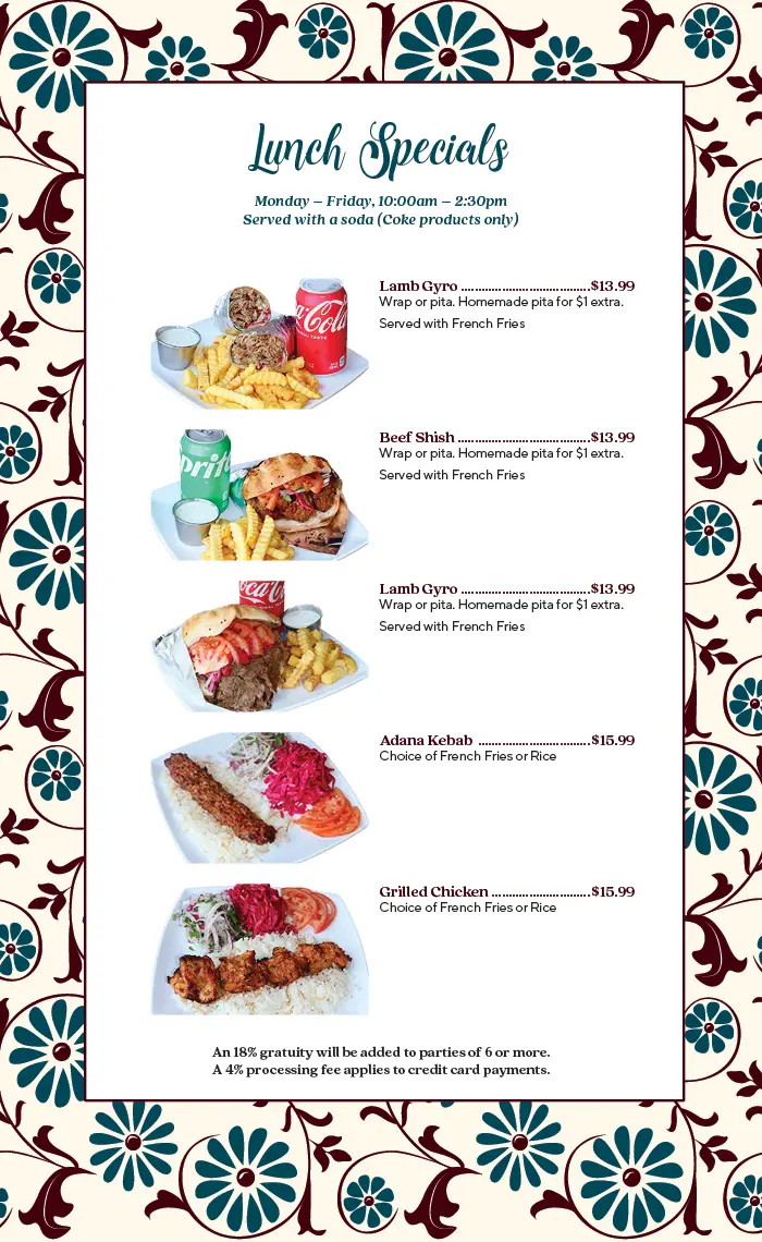
Restaurant Menu Redesign
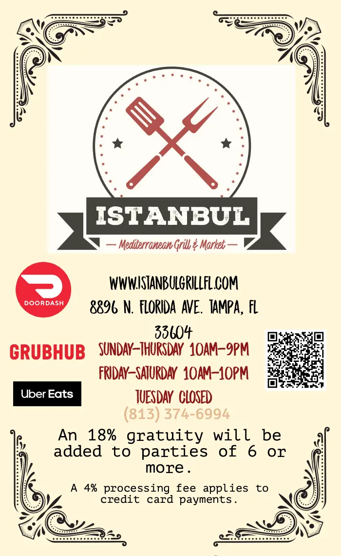
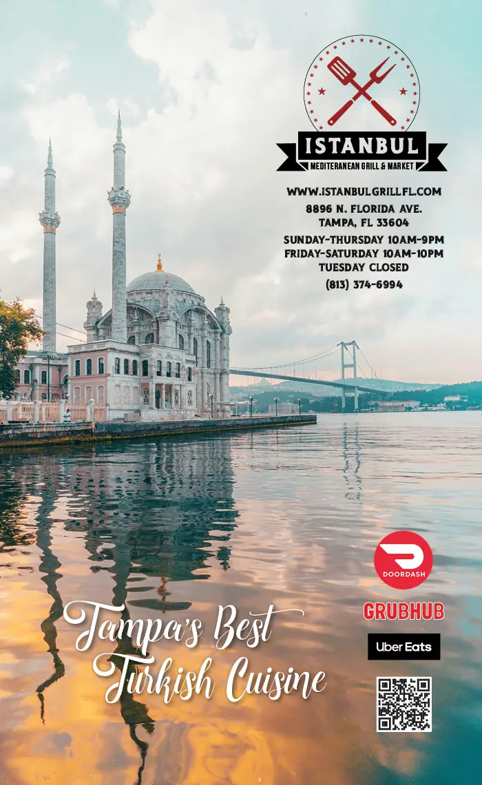
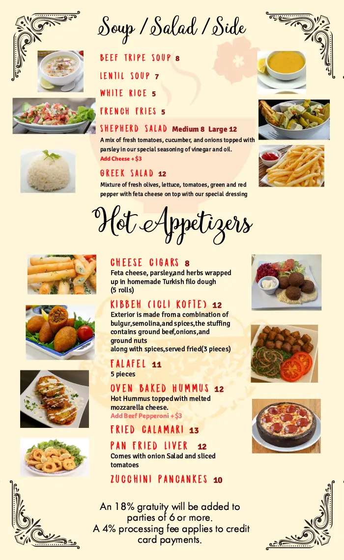
When the owner of Istanbul – a Turkish spot just north of Old Seminole Heights, and our favorite place for both pide and mantı – came to us, we were thrilled. His original menu had good bones: organized sections, legible entries, a clear sense of what went where. But it was missing the wow factor. Backgrounds fought with text, and matching dishes to descriptions took more guessing than it should. We kept his vision intact and just turned up the volume: his menu, but with the wow factor finally dialed in.
Same menu, same great food – now it’s just easier to order.
Before
After
Before
After
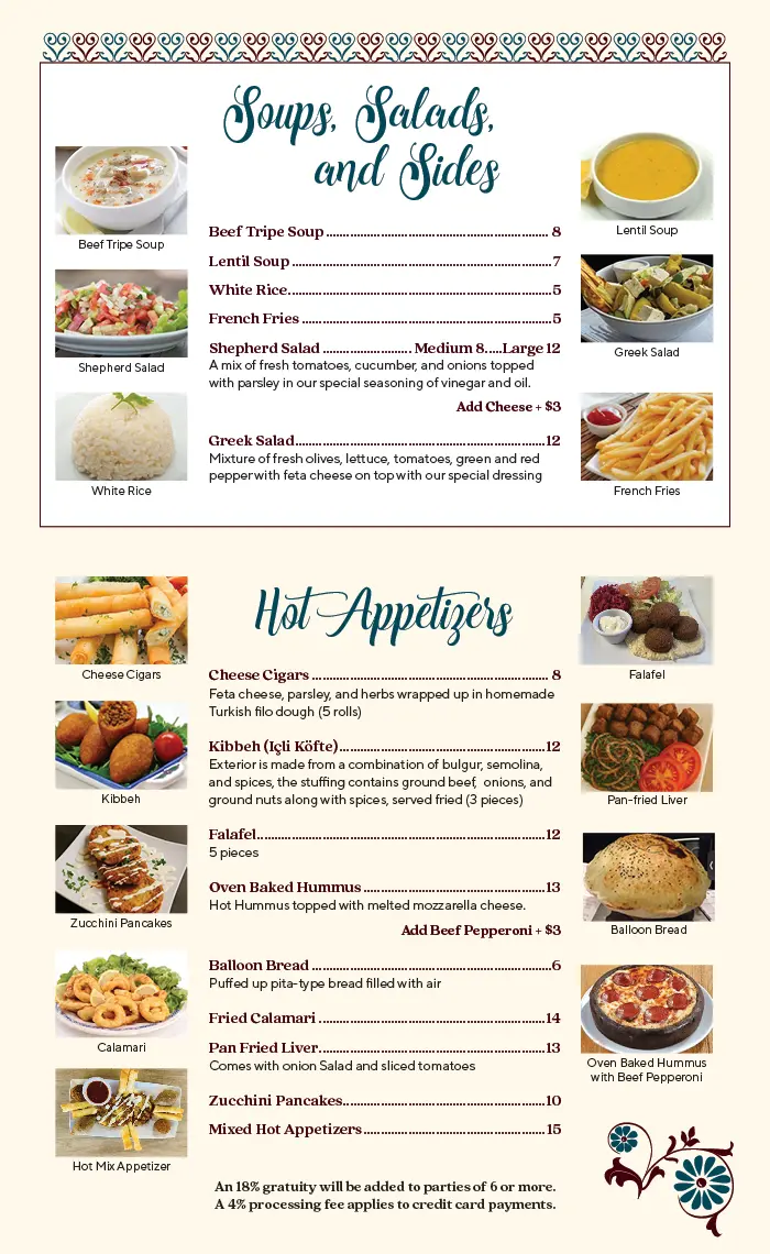
Before
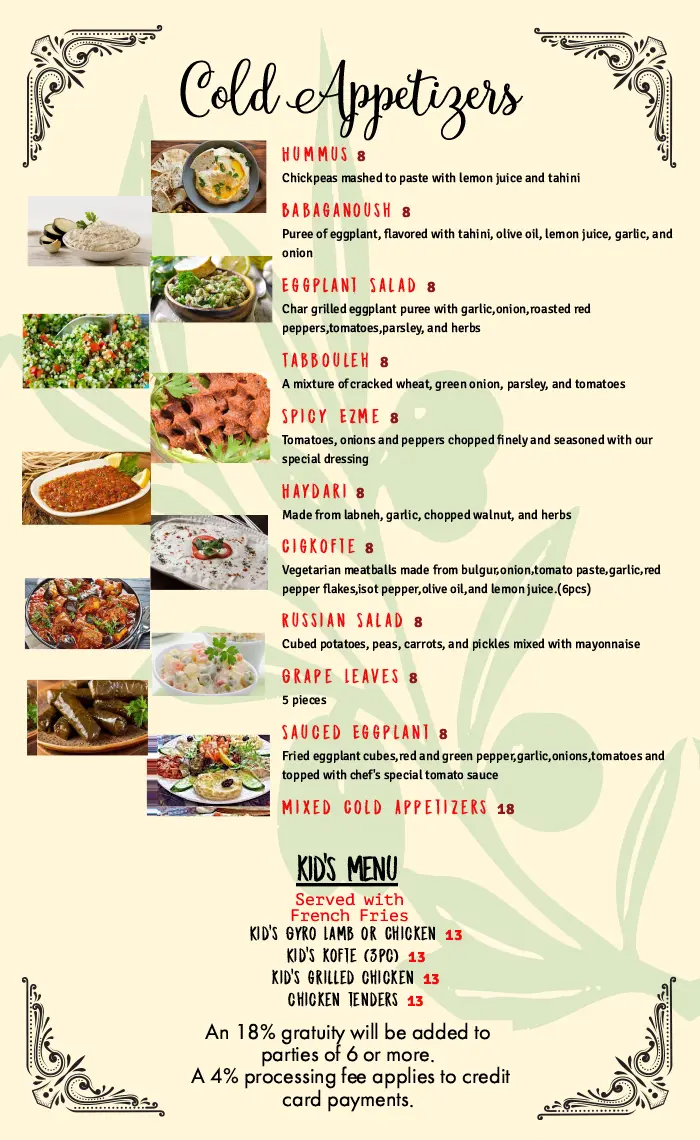
After
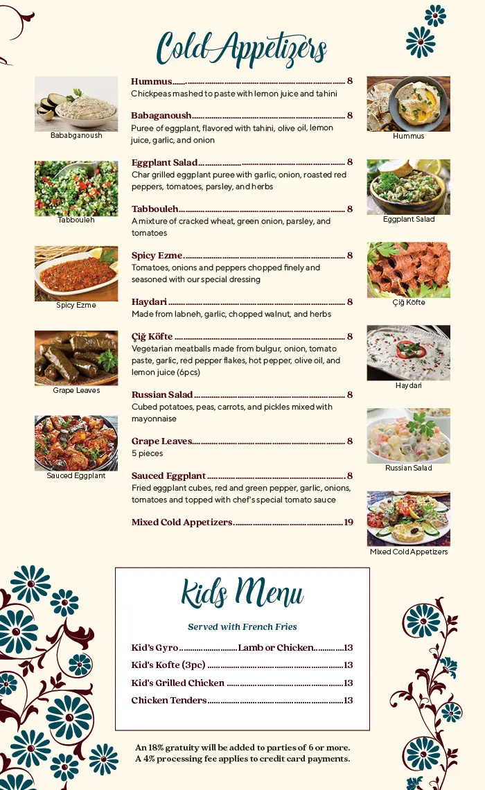
Before
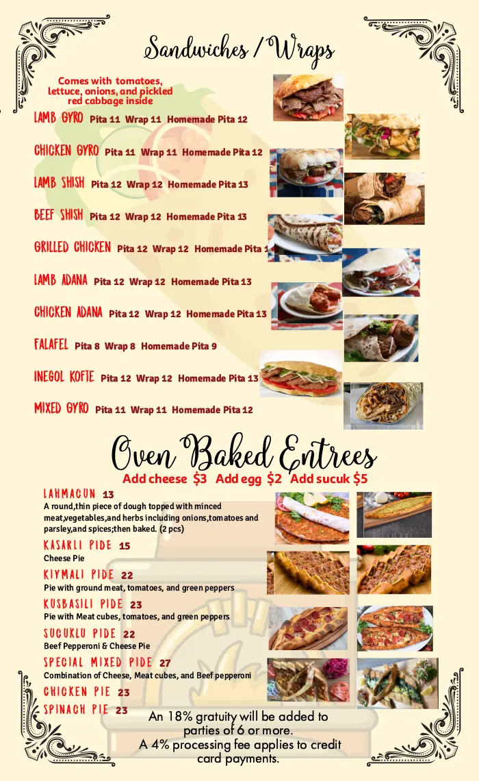
After
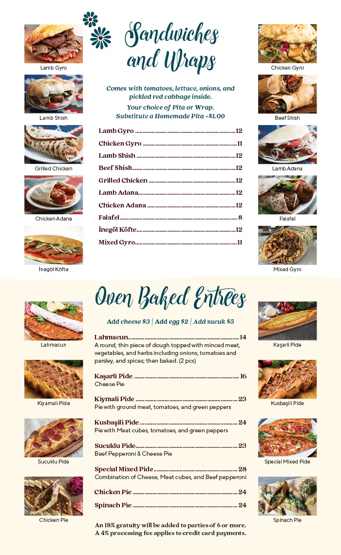
Before
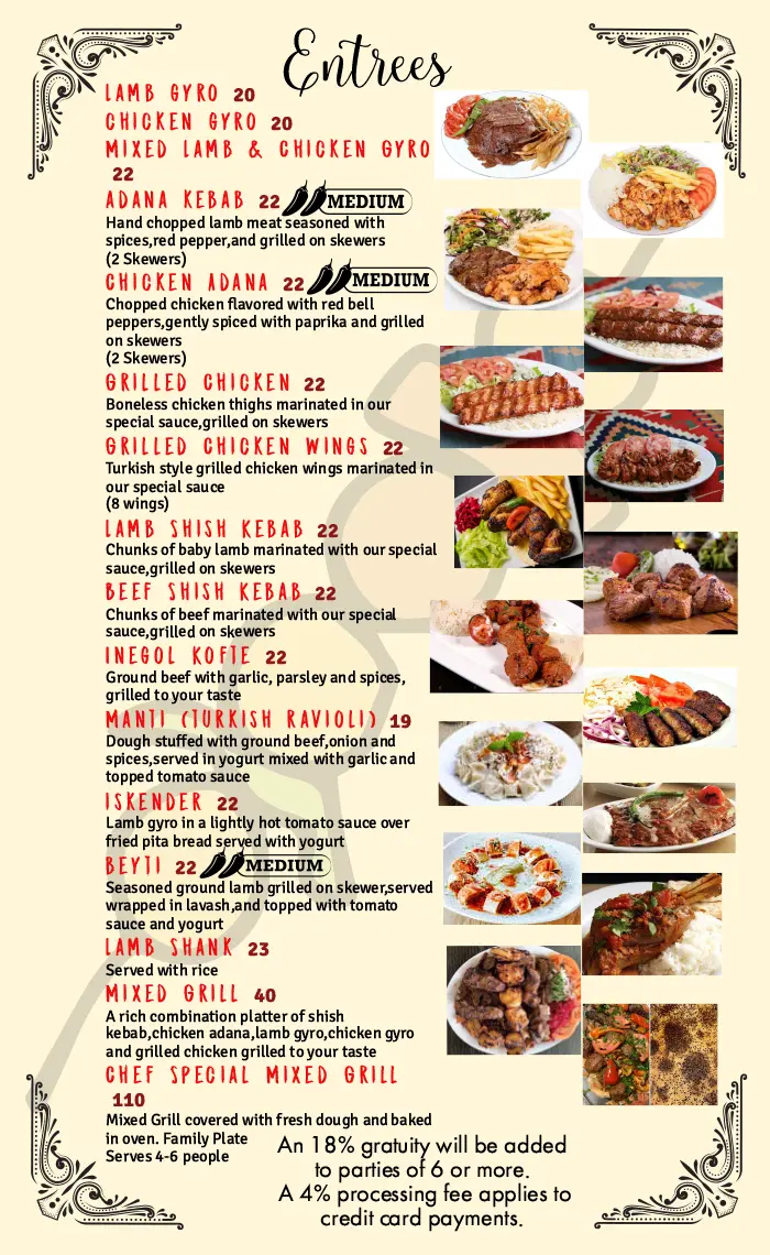
After
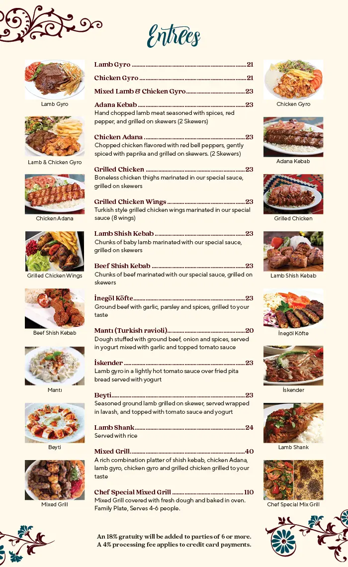
Before
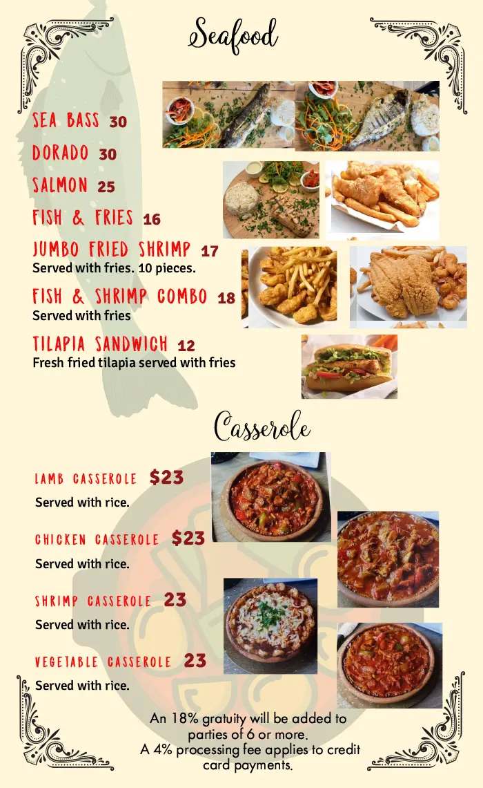
After
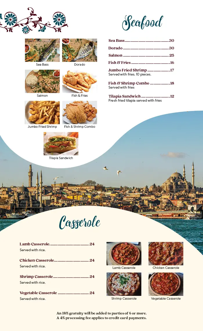
Before
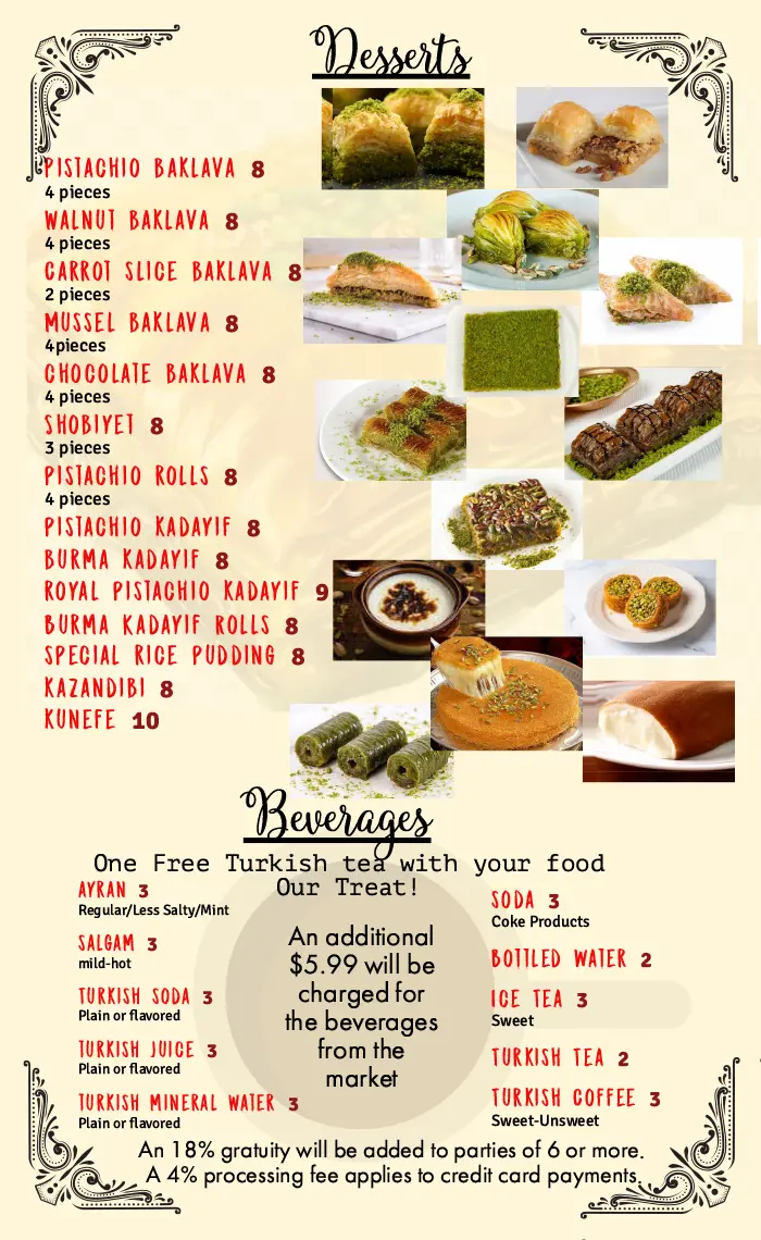
After
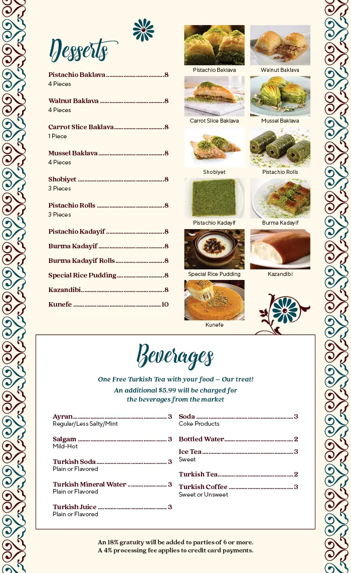
Before
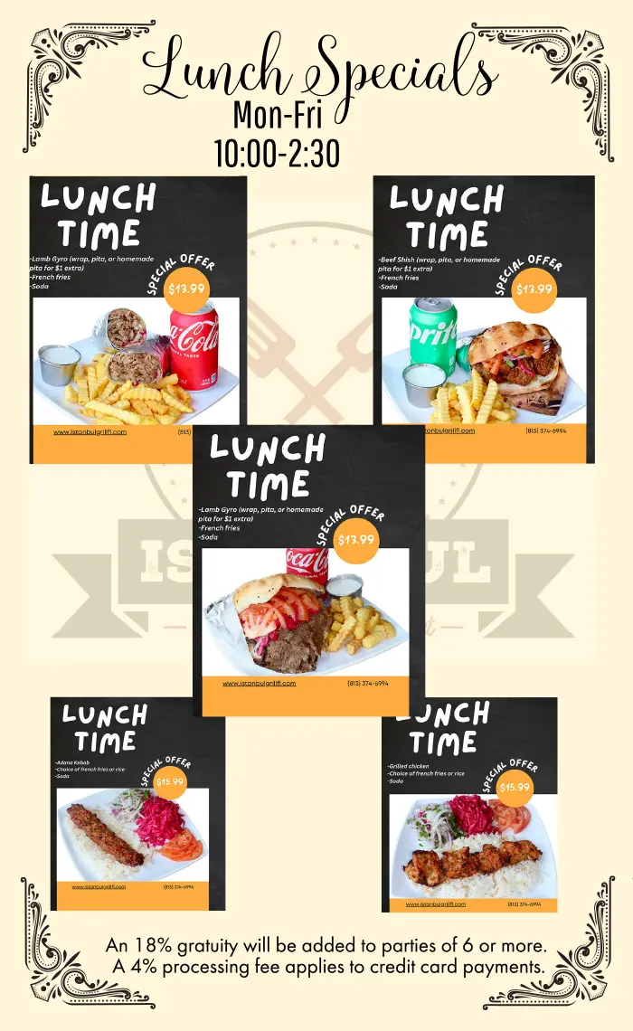
After
Senior Living Activity Calendar Redesign
These actual client designs are made generic for privacy.
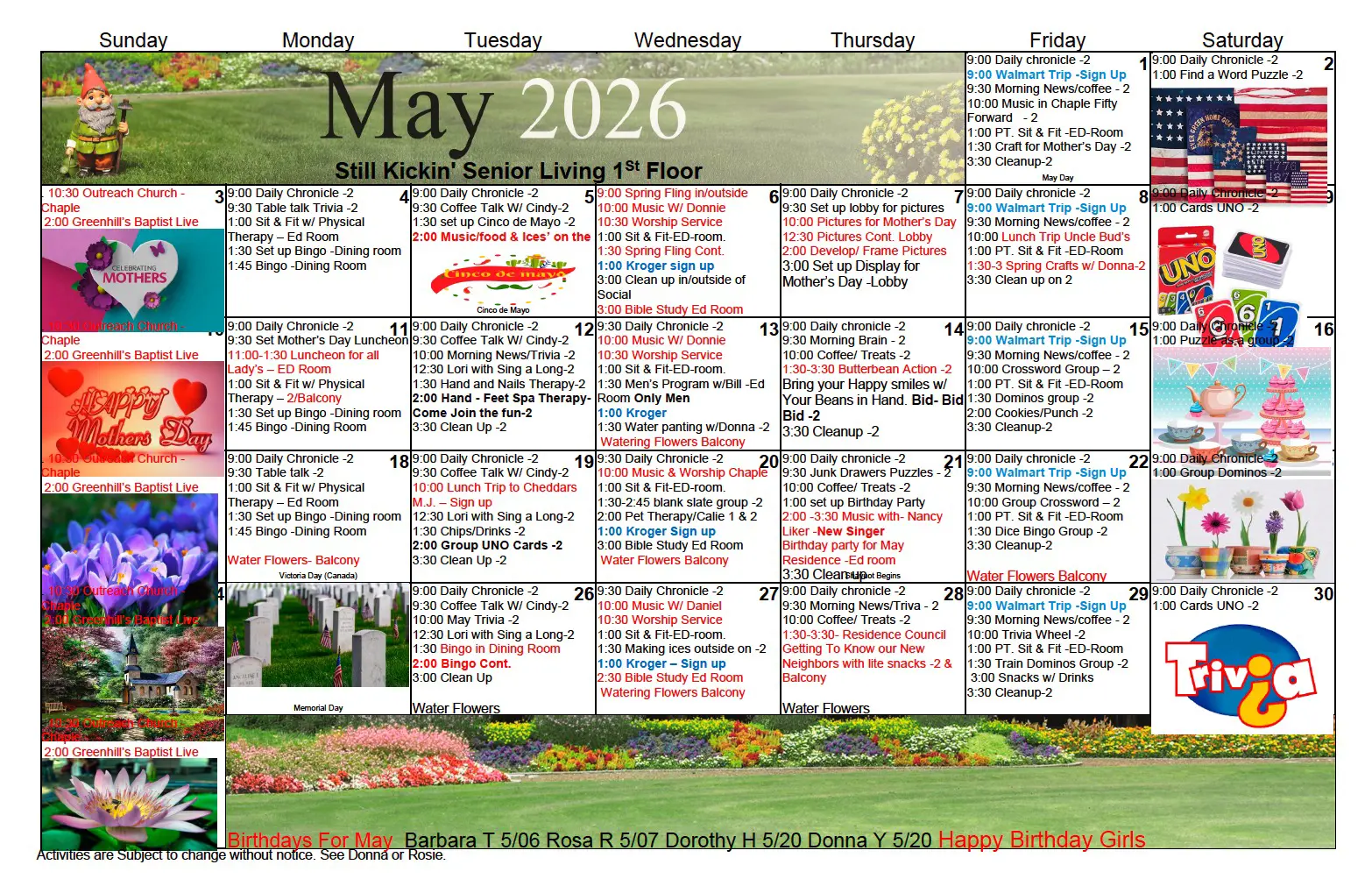
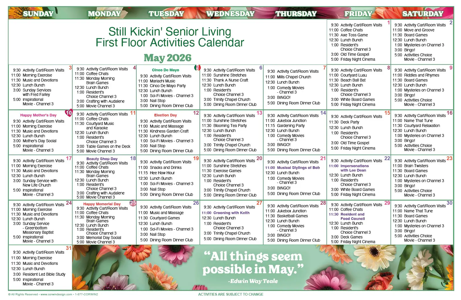
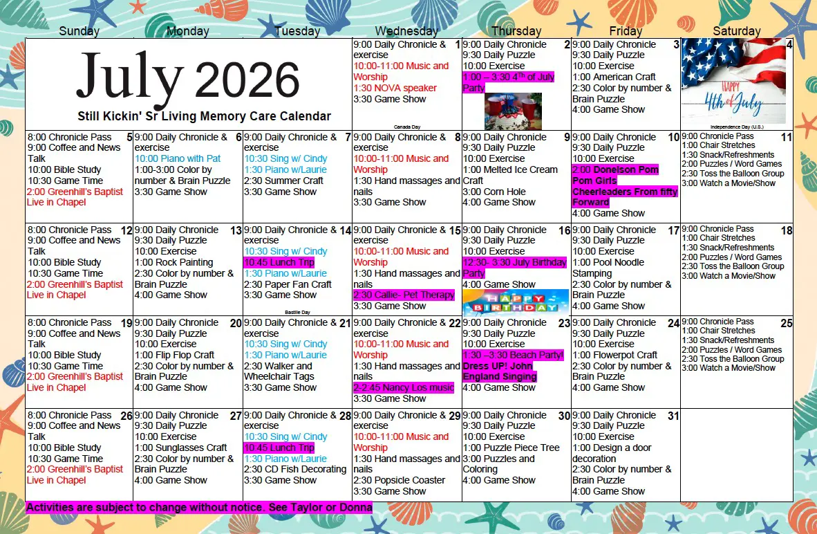
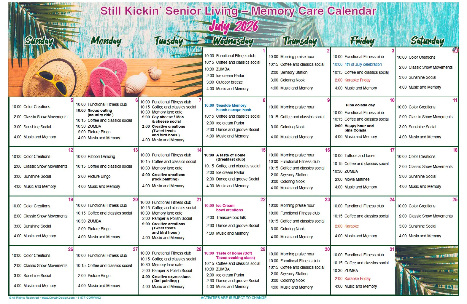
The “before” calendar had everything a community needs – daily activities, birthdays, holidays, even a gnome for good measure. But with mismatched fonts, clashing colors, and text crammed into every open inch, it was doing a lot of work to be read. We gave it room to breathe: a clean grid, a cohesive color palette, and typography that doesn’t compete with itself. Same packed schedule, same community spirit – just easier for residents (and their families) to actually use.
Still just as busy. Just a lot less busy-looking.
Before
After
Before
After
Logo Redesign
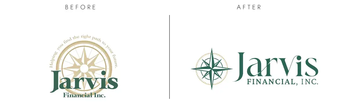
The original Jarvis Financial logo had a solid concept with a classic compass that the client wanted to keep. But the design was busy: a long tagline arched overhead, the compass rose competing for attention, and “Financial Inc.” squeezed in. We simplified the compass into a clean, confident mark, gave the wordmark room to breathe, and added ligatures for visual interest. We moved the tagline into other parts of the branding where it was more legible. Same direction, now easier to follow.
Still pointing the right way. Just easier to read from across the room.
Business Card Redesign
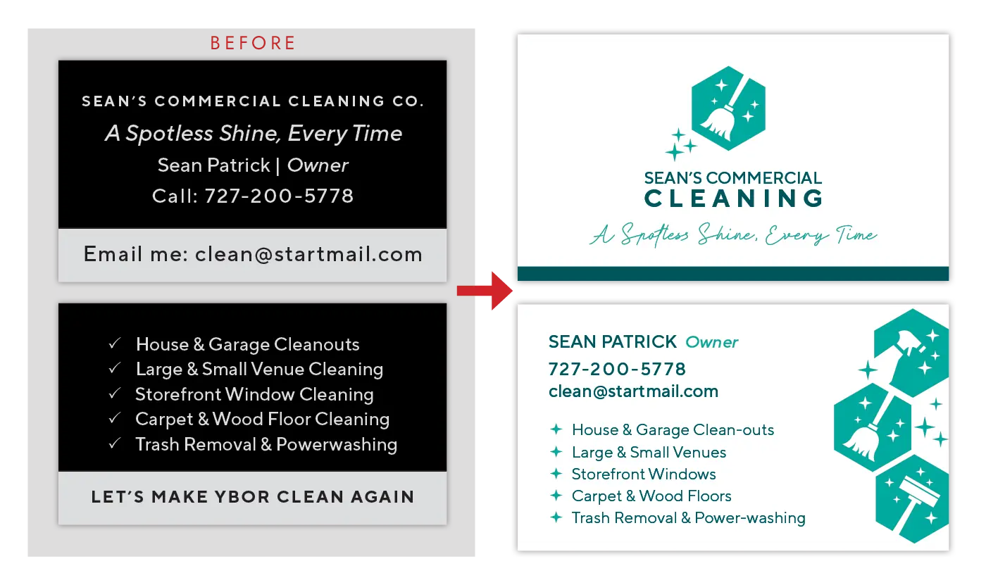
The original card got the info across: name, number, services, a checklist you could actually read. But it was doing that in plain black-and-white blocks, with zero visual identity to make it memorable. We gave Sean’s Commercial Cleaning an actual brand: a teal hexagon icon system, a proper logo lockup, and a card that looks like it belongs to a company you’d trust with your storefront windows. “Let’s Make Ybor Clean Again” didn’t make the cut, but honestly, we miss it a little.
Still spotless. Now it looks the part.