
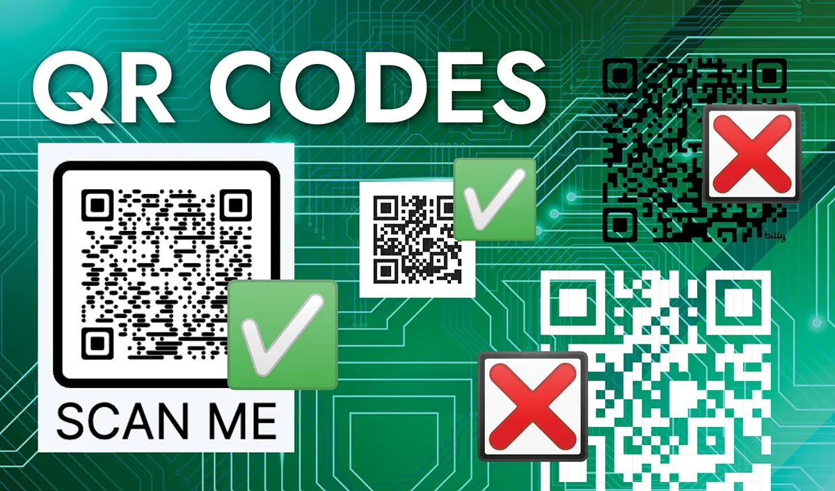
We’ve all been there: you design a gorgeous layout, squeeze a sleek QR code into the corner, send it to the printer, and… nothing. When the final product arrives, your phone camera just stares blankly at the code like it’s looking at a wall.
As printers, we see QR code mishaps on a regular basis. Most of the time, these issues are entirely preventable if you know how QR technology actually works.
Before you send your next design to print, here is the ultimate guide to creating high-performing, instantly scannable QR codes.
A QR code isn’t just a picture, it’s a redirect
A QR code doesn’t store your logo, your brand colors, or a memory of your website. It stores data, usually a URL, encoded as a grid of black and white squares called modules. When a phone camera scans it, it reads those modules and sends the phone to that URL.
This matters because every extra character in that URL adds more modules to the grid. A short link takes fewer modules and produces a simpler, more open pattern. A long, ugly URL with tracking parameters takes more modules, which makes the whole pattern denser and each individual square smaller. Denser codes are more sensitive to size, contrast, and print quality.
The size floor
The baseline minimum for a QR code is about 0.8 x 0.8 inches, or 2 x 2 cm, to ensure reliable scans. For anything denser than a short URL, increase the code so modules remain readable, with 1.2 x 1.2 inches as a practical working minimum.
Is it really a hard rule?
No, it’s not a hard rule, but it is a highly reliable practical standard. Here is why:
- Camera Focus: Standard smartphone cameras need physical space to resolve and focus on micro-sized objects.
- Real-World Conditions: While a brand-new flagship phone might scan a tiny 0.4″ code in perfect lighting, an older phone in a dimly lit restaurant or a dark garage will fail instantly.
- The 10:1 Rule: As a rule of thumb, the ratio of the scanning distance to the size of your QR code should be 10:1. If a user is holding a business card about 8 inches from their face, the QR code needs to be at least 0.8 inches to register comfortably.
Can you print smaller? Yes. We occasionally print codes in smaller sizes at customer request, against our recommendation – this is your choice. However, doing so requires stripping away all “design flare” (like center logos), maximizing contrast, and using high-precision vector files, and is at your own risk. If you go small, you must simplify.
The Danger of Center Graphics (Why Your “Cool” Design Fails)
Many brands put a custom logo right in the middle of their QR codes. How does this work without breaking the link?
QR codes have built-in Error Correction (ECC). This means the code actually duplicates its data so that if up to 30% of the code is damaged, dirty, or covered by a logo, a phone can still successfully read it. Designers take advantage of this safety net to block out the middle of the code with a custom logo.
The Catch:
If you put a logo in the middle of your code, you have exhausted your safety margin.
If that code is also printed very small, any minor printing defect, paper texture, ink bleed, or camera lens smudge will push the code past its 30% limit. The phone will no longer be able to “guess” the missing data, and the code becomes completely useless.
💡 Pro-Tip: If your QR code is going to be printed smaller than 1 inch, do not use a center graphic. Keep it as a clean, classic, high-contrast grid: black on white.
A logo has to stay centered, stay under roughly 20 percent of the code’s total area, and steer clear of the three large squares in the corners, which are what the scanner uses to find and orient the code in the first place. That 20 percent ceiling assumes you’re already working with a code that has room to spare. On a code that’s already too small for its data, adding a logo doesn’t leave a margin, it eats into it.
The Forgotten Essential: The “Quiet Zone”
A QR code is not just the black-and-white grid; it also requires the blank border surrounding it, known as the Quiet Zone.
According to official ISO standards, a QR code quiet zone must be at least 4 “modules” (the tiny individual squares) wide on all four sides.
Without this white border, the camera cannot distinguish where your QR code ends and your background design, packaging text, or card edges begin. Never crop your QR code files too tightly, and never let text or background textures creep into this boundary. Adding a black border to your QR code makes it even smaller, because you still need the white area around the QR code itself.
Rounded vs. Squared-off Designs
Many modern QR code generators let you customize the “dots” inside the code to be rounded, circular, or smooth instead of the classic harsh squares.
While rounded codes look sleek and modern on a digital screen, they are a printing hazard at small sizes:
- Smaller Target Points: Rounding off the corners of the squares physically removes black pixels. This leaves less “active” data area for a phone camera to lock onto.
- Zero Tolerance for Ink Bleed: Standard printing processes involve a tiny amount of natural ink spread. On a classic squared-off code, this is harmless. On a rounded code, even a microscopic amount of ink bleed will distort the delicate rounded shapes, causing the scanner to misread the coordinates.
The Rule: If your QR code is large (e.g., on a window display or poster), feel free to go rounded. But if you are printing on a small label, packaging, or business card, now is not the time to get fancy. Stick to classic, sharp, squared-off pixels.
Distance Matters as much as Size
Size isn’t just about the code itself, it’s about how far away someone will be standing when they scan it. A simple guideline: the code should be no wider than roughly one tenth of the expected scanning distance. A code meant to be scanned from a foot away needs to be bigger than one meant to be held right up to the camera, and a code on a business card is almost always being scanned at close range, which is exactly why the size floor matters so much there.
The Short Version
A QR code is only as good as its weakest link, and on a small card, that weak link is usually size. Shrinking the code and adding a graphic at the same time asks it to do two things that work against each other. If we’re doing your design, provide the link to us to create the QR code.
Here’s what actually gets QR codes scanning reliably:
Shorten the link first, and keep the destination URL as short as the platform allows, since shorter data means bigger, more forgiving modules.
Size the code to the printed item. If a small size is a hard constraint, the code needs to be plain, high contrast, black on white, and without decoration. If a center graphic is non-negotiable, the label needs to grow to at least 1.2 x 1.2 inches to accommodate it.
Export as a vector, not a screenshot. A vector file scales cleanly to whatever the final print size needs to be without softening the module edges. Generally, this is SVG format.
Don’t over-design. Use black ink on a white background, with straight edges. The standard is a standard for a reason.
Test it printed, at actual size, on the actual material, before the full run goes out. A code that scans fine on a screen doesn’t always scan the same way once it’s printed small and glossy.
Further reading: QR Code Design Best Practices