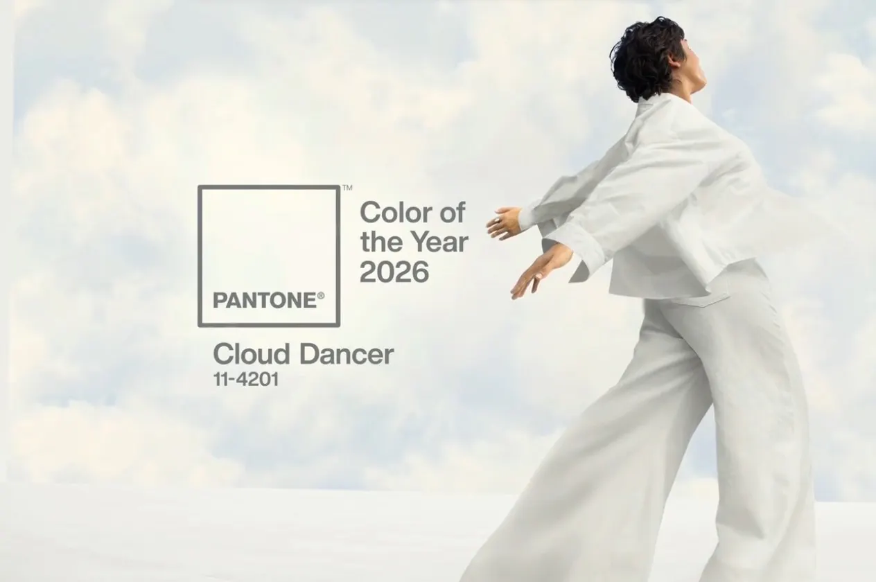
Pantone’s Color of the Year 2026 is.. White?
- Cloud Dancer (Pantone 11-4201) is the first white shade ever crowned Color of the Year. But really, can you use white more than once? I guess we will see.
- It’s an “off-white” rather than a bright, clinical white. Soft, balanced, drifting somewhere between warm and cool.
- On paper (or paint chip), it might read as “boring.” Yes, many will raise an eyebrow at a snooze white being tapped as “the color of 2026.”
So… are we just skipping “Millennial Gray”?
You might ask… if non-colors are an option, why not go for a moody gray? A shade like “Millennial Gray” (the most infamous of the soft grays that have circulated in recent years) might’ve felt cheeky – familiar enough to be comfortable, but with more context and vibe.
But perhaps that’s exactly why Cloud Dancer wins in the realm of desaturated hues. Instead of leaning into nostalgia or trendiness, it offers a kind of reset. It doesn’t demand attention; it invites calm. In a world of over-saturation – visually and mentally – maybe what we needed wasn’t more “look at me,” but less noise. A lot less.
When white makes sense
White space ≠ emptiness
White has long been the unsung hero in art, web design, interiors, fashion. White space doesn’t mean nothingness, it means breathing room. It gives your content, your layout, or your room permission to exist, to breathe, to shine.
Cloud Dancer channels that principle: Pantone describes it as a “lofty white neutral whose aerated presence acts as a whisper of calm and peace in a noisy world.”
That whisper matters. It’s a chance to slow down, to simplify.
A Blank Canvas for Creativity
Rather than impose a mood, Cloud Dancer hands you a blank slate. Designers and artists, whether in interiors, fashion, graphic work or even product design, now have a neutral base that flexes.
Because it balances warm and cool, light and shadow, it can be paired with pastel hues, vivid tones, or natural materials like wood and stone without feeling jarring.
Calm in Chaos: A Reset for 2026
In a world overwhelmed by visual noise, constant change, and digital overload, maybe what people truly crave is space to reset, reflect, and reconnect. That’s exactly the message Pantone seems to be sending. Cloud Dancer signals a longing for serenity, clarity, and a future less cluttered by chaos.
Why some might love Cloud Dancer – and why some won’t
✅ It’s timeless and versatile. As a neutral, it doesn’t go out of style, and it blends seamlessly across different design languages (modern, rustic, minimal, cozy, you name it).
✅ It leaves room for personality. You can lean into soft pastels, bold statement pieces, warm woods, or cold metals – Cloud Dancer won’t fight for attention, but enhances contrast instead.
✅ A well-placed white feels intentional. A crisp white tee, a minimalist living room, a clean webpage layout – all feel deliberate, collected, and thoughtful.
⚫️ It might feel too safe. For those who love boldness, color trends, and maximalist expression – this white might seem like a cop-out. Some may read it as “uninspired,” or even “timid.”
⚫️ Risk of sterility. Use white poorly and what’s meant to be airy can come across as clinical or soulless.
A Few Ways to Use Cloud Dancer In Design, Interiors, or Everyday Life
You probably already know how to use white. It’s a default for a reason! But intentional white space hits different.
- Create breathing room with purpose
Use it to carve out visual pauses in a layout or composition. Think of it as the designer’s equivalent of a deep inhale – a space that guides the viewer’s eyes and gives important elements room to shine. - Shape hierarchy instead of filling gaps
Place it where you want attention to land after a focal point. It can frame a bold image, anchor delicate typography, or act as a calm border that directs the flow of information. - Highlight contrast through restraint
Let it sit next to a saturated color or a textured element so that the contrast becomes part of the storytelling. The white isn’t the star; it’s the spotlight operator. - Signal refinement and clarity
When a page, wall, or design feels cluttered, use it as an intentional reset. It creates clarity without feeling cold; a controlled quiet that reads as polished rather than plain. - Build rhythm instead of uniformity
Treat it like a rest note in music. Strategic moments of white can establish cadence, letting the bold parts of design hit harder because they’re surrounded by space that gives them meaning. - Use it to unify, not disappear
Cloud Dancer can knit together mismatched colors, mixed materials, or several strong elements. A consistent white acts as connective tissue, subtle but powerful.
White Space is Nice Space
Cloud Dancer may not scream “look at me!” and maybe that’s exactly its point. In a world that sometimes feels loud, fast, and overwhelming, a tender, billowy white might just be the calm pause we need.
White space – whether on a wall, a webpage, or a canvas – gives our eyes, and our minds, room to roam. It invites reflection and creativity.
So yes: white might seem boring on the surface. But if you give it room to live, breathe, and evolve, it becomes your quiet accomplice.

