The Anatomy of a Redesign
How strategic design decisions transformed a website into a lead-generation powerhouse. Best viewed on desktop.
In today’s digital-first world, your website is often the first (and sometimes only!) chance to make an impression on potential clients. You have mere seconds to establish credibility, communicate value, and guide visitors toward taking action. This reality spans every industry, from professional services to e-commerce, making strategic web design a critical business investment.
The transformation of Jarvis Financial’s digital presence represents this strategic approach, prioritizing user experience, conversion optimization, and modern design principles.
The original Jarvis Financial website suffered from common pitfalls that plague many service providers: outdated design aesthetics, unclear value propositions, poor visual hierarchy, broken links, and weak calls to action. The redesigned version addresses each of these critical issues while elevating the brand’s professional credibility and conversion potential.
This transformation demonstrates how thoughtful design changes can directly impact business outcomes. By focusing on user-centered design principles, clear messaging hierarchy, and conversion optimization, the new site creates multiple pathways for engagement while building the trust essential for financial advisory relationships.
Let’s examine the specific improvements across five key pages that showcase the dramatic evolution from a mostly functional but unremarkable web presence to a conversion-focused digital marketing asset.

Logo Update: From Ornate to Refined
The original’s ornate design appeared cluttered and dated. The tagline “Helping you find the right path to your future” was barely legible when integrated into the logo design.
The redesigned logo embraces clean design while maintaining the traditional compass symbolism that perfectly represents financial guidance.
The tagline was relocated to other branding elements where it can be properly featured and read — demonstrating that effective logos don’t need to pack every brand element into one mark. The streamlined design scales beautifully across all platforms and immediately signals a forward-thinking firm that values precision and professionalism.
❶ Homepage
From Generic to Compelling
The Challenge
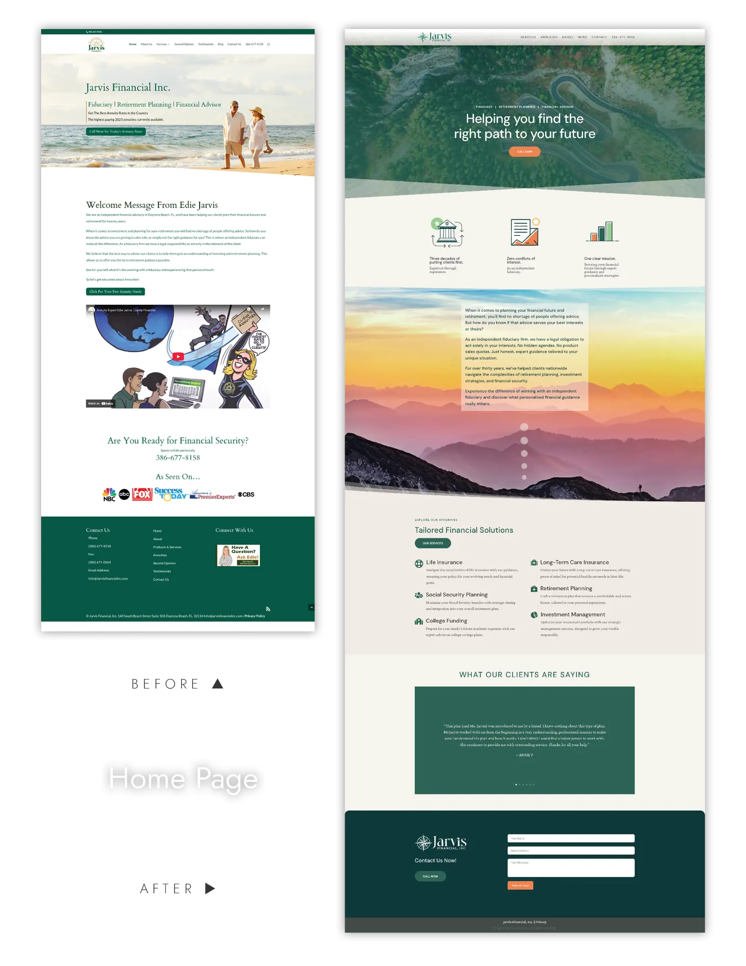
The original homepage featured a cramped layout, weak visual hierarchy, and generic imagery that excluded potential clientele.
The Transformation
The redesigned homepage immediately establishes authority and trust through sophisticated visual design and strategic messaging hierarchy. We pulled the tiny tagline from the logo and featured it instead in the hero section which now leads with it: “Helping you find the right path to your future.” This is a client-focused value proposition that resonates emotionally while positioning Jarvis as a guide rather than a salesperson.
The new design leverages modern web standards with clean typography and strategic white space, while keeping the client’s preferred color palette. Most importantly, the messaging architecture now follows proven conversion principles: establishing credibility (“Three decades of putting clients first”), addressing pain points (“No hidden agendas. No product sales quotas”), and providing social proof through the emphasis on fiduciary responsibility and client testimonials. The new “Tailored Financial Solutions” section gives an easy-to-digest overview of what services are available.
Traffic and Lead Generation Impact
This homepage transformation directly addresses the two primary factors that drive website conversions: trust establishment and clarity of next steps. The original design’s high bounce rate was likely caused by visitors questioning if the firm was modern and up-to-date. The redesigned version immediately communicates thoughtful, modern design principles which lends expertise and trustworthiness, encouraging visitors to explore deeper.
❷ Services Page
From Wall of Text to Sleek Functionality
The Missing Info
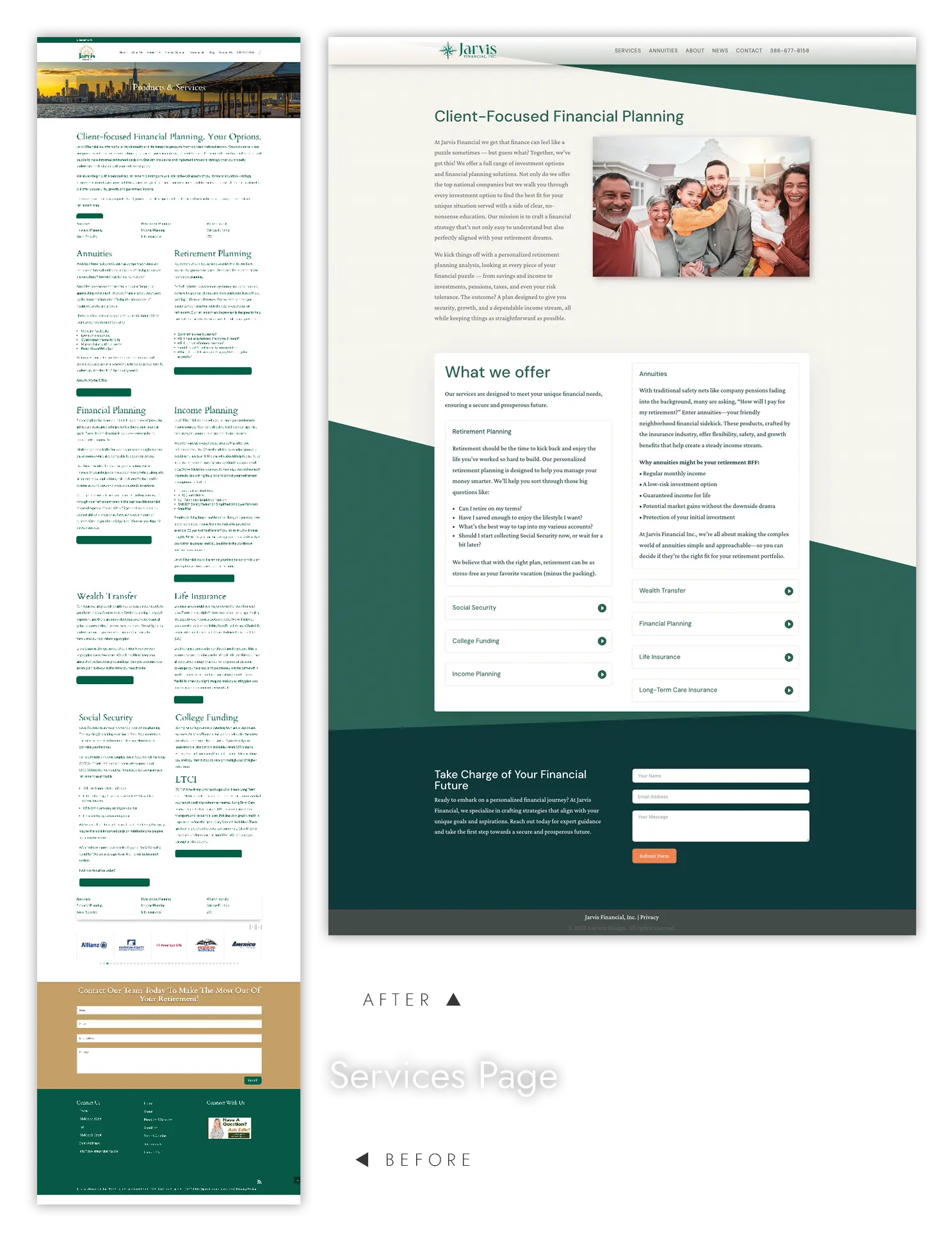
The page suffered from a fundamental usability issue: missing button text that left visitors unable to navigate or take action. This type of oversight signals poor attention to detail and can immediately undermine credibility. The page also presented information in the dreaded “wall of text” that overwhelmed visitors trying to understand service offerings.
The Sleek Solution
The redesigned services page transforms the experience with a clean accordion-style layout that organizes information intuitively. Each service expands to reveal relevant details without overwhelming the page layout, while allowing an overview of all services at a glance. Most importantly, every interactive element functions properly, with clear and actionable text that guides visitors toward next steps.
The Detail-Driven Impact
Attention to detail in web design directly correlates with perceived professionalism and trustworthiness. When visitors encounter broken functionality or missing elements, it raises immediate questions about the quality of actual services. The new accordion design not only improves usability but demonstrates the meticulous care clients can expect from the firm. This attention to detail can improve conversion rates by 30-50% simply by eliminating friction and building confidence in the user experience.
❸ Annuities Page
From Overwhelming Information to Digestible Education
The Presentation Problem
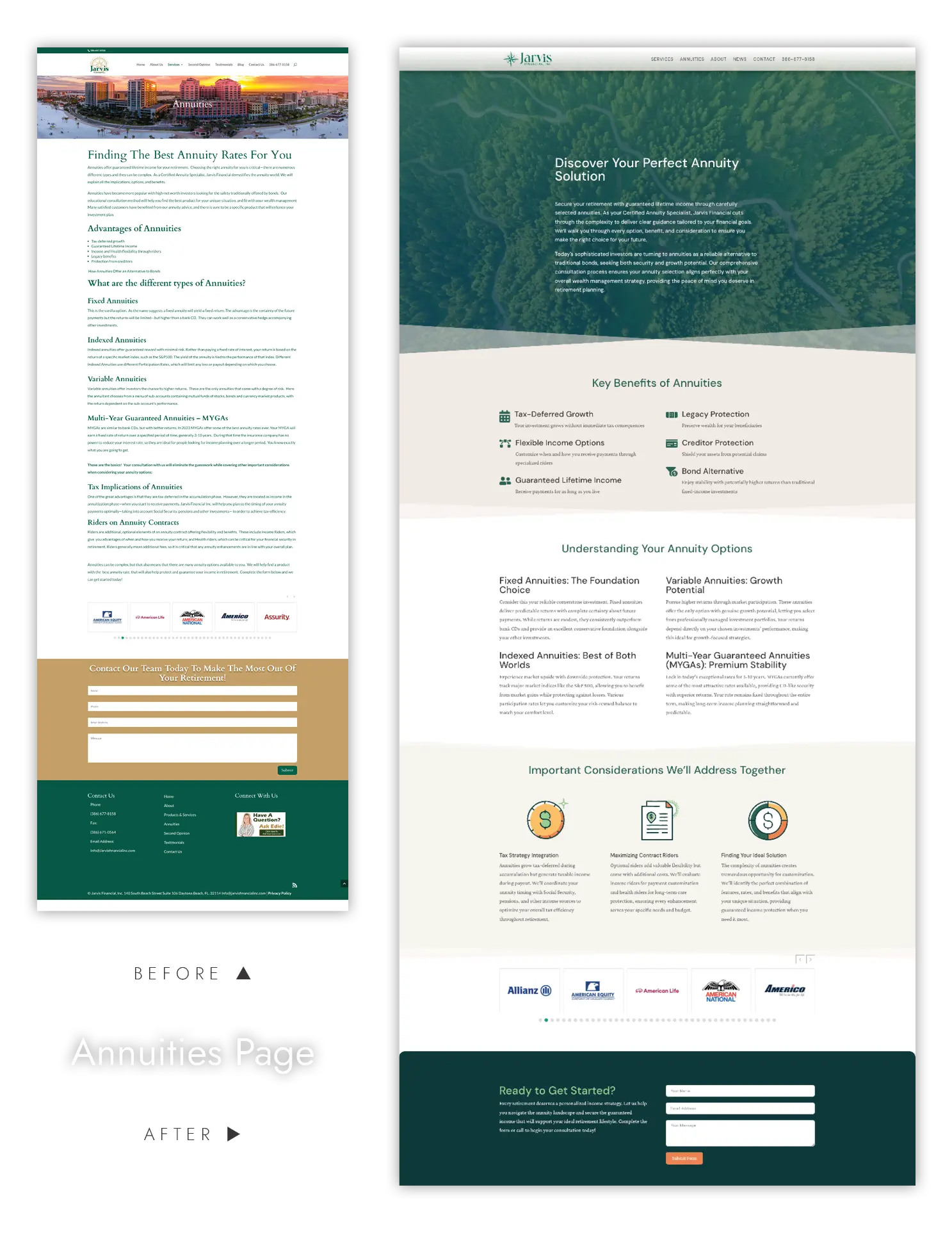
The original annuities page led with product features rather than client problems, emphasizing “getting the best rates,” which positioned Jarvis as a product broker rather than a strategic advisor. And while the page intended to be educational, the information was presented in dense, overwhelming blocks that made it difficult for visitors to absorb and act on the content.
The Organized Redesign
The redesigned annuities section maintains its educational focus but transforms how information is presented. Content is now broken into smaller, digestible sections with clear headings, bullet points, and visual hierarchy that guide readers through complex topics step-by-step.
By organizing information into scannable chunks and using strategic white space, the new design makes educational content easily accessible. Visitors can quickly find relevant information and dive deeper into topics that matter to their specific situation, positioning Jarvis as both knowledgeable and considerate of the reader’s time.
Improved Engagement and Conversion
Well-organized educational content typically improves page engagement by 60-80% and lead quality by 50-70%. When visitors can easily consume and understand complex information, they’re more likely to view the advisor as both expert and accessible – a crucial combination for financial services.
❹ About Page
Building Personal Connection and Trust
The Original’s Missed Opportunities
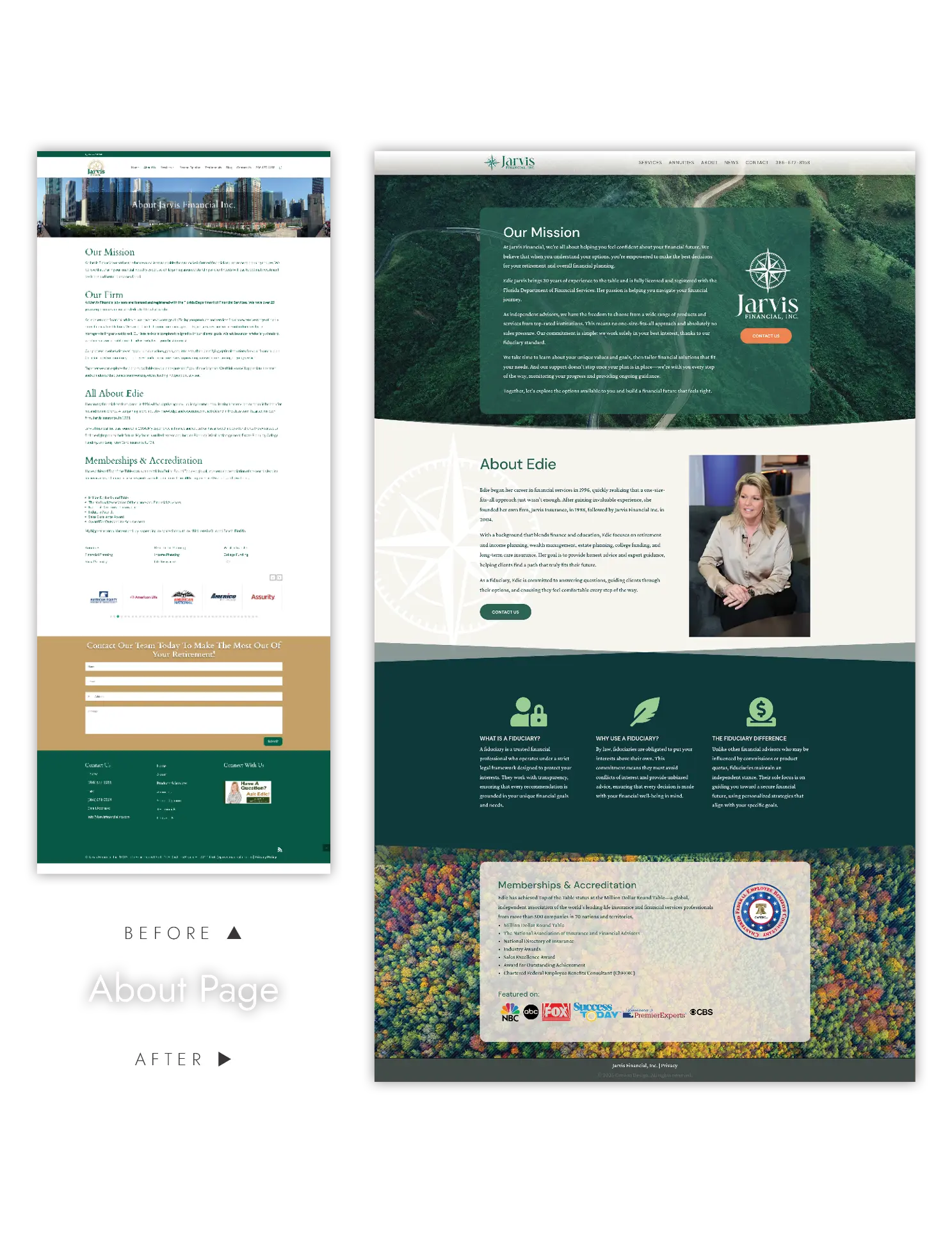
The original about page focused on company history rather than client benefits, using generic language that failed to differentiate Jarvis from similar firms. The lack of personal storytelling and specific credentialing information missed crucial opportunities to build the relationships essential in financial services.
The Strategic Redesign
The new about page transforms the company story into a client-focused narrative that emphasizes outcomes over history. By leading with client benefits and weaving credentials throughout the story, the content maintains engagement while building authority.
The addition of personal details about Edie Jarvis creates the human connection essential for financial advisory conversions. When potential clients can visualize working with her and understand her background, trust builds more rapidly than through generic company descriptions.
Conversion Optimization Results
About pages are typically the second most visited pages on financial advisor websites, making them crucial for conversion optimization. The redesigned approach addresses the key decision factors potential clients evaluate: expertise, trustworthiness, and cultural fit.
Financial advisors typically see 25-40% improvement in about page conversion rates when shifting from company-focused to client-benefit focused narratives.
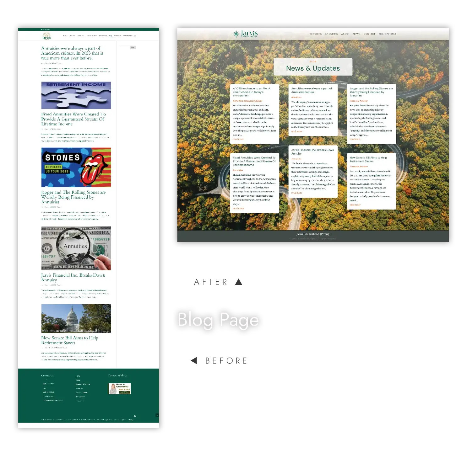
❺ Blog Page
When Less is More
The Clutter
The original blog presented one blog at a time, with large images that didn’t add value. This buried content behind poor navigation and layout, making it difficult for visitors to discover and read educational materials that could demonstrate expertise.
The Strategic Transformation
With only a few articles, removing the unused sidebar and featured photos allowed visitors to see everything at a glance. The redesigned blog creates an intuitive, accessible experience that showcases thought leadership content effectively, transforming the blog from an image gallery into a content library.
Long-term Traffic and Authority Building
Better blog accessibility drives increased engagement with educational content, leading to longer site visits and improved search engine rankings. Visitors who can easily discover and consume relevant content are more likely to view the firm as a trusted authority, directly impacting consultation requests and client acquisition.
The Compound Effect of Comprehensive Redesign
The true power of Jarvis Financial’s redesign lies in creating a unified professional identity that reinforces credibility across every interaction. The cohesive design standards, refined visual elements, and meticulous attention to detail work together to create a comprehensive brand experience that immediately signals trustworthiness and expertise.
This polished, professional presence builds visitor confidence from the first impression through every subsequent touchpoint. When prospects encounter consistent quality and attention to detail across all pages, it reinforces their perception of the firm’s competence and reliability — critical factors in financial advisory selection.
The comprehensive branding approach typically results in 150-250% improvement in website conversion rates within the first six months, along with significant improvements in search engine rankings due to better user experience signals. Most importantly, the elevated professional image attracts higher-quality prospects who are more likely to become long-term, high-value clients.
The transformation represents more than a design update – it’s a strategic brand elevation that aligns digital presence with professional standards, creating a sustainable competitive advantage in an increasingly crowded financial advisory market.
What to Expect with Corwin Design
Custom & Responsive Design
Every website we build is tailored to your brand, ensuring a seamless look and feel across every device — from widescreen monitors to mobile phones. We can host your site, or you can.
User Experience (UX) Mastery
We craft intuitive, easy-to-navigate sites that guide your visitors exactly where you want them to go. Your website isn’t just beautiful — it’s built to inform.
Lightning-Fast Performance
Slow websites are so last decade. We optimize every pixel and line of code to ensure your site loads quickly and runs smoothly.
Ongoing Support & Maintenance
If you choose a hosting plan with us, your digital journey doesn’t end at launch. We’re here to provide updates, tweaks, and support to keep your site in tip-top shape.
